Lately, I've been thinking a lot about starting to do some serious freelance work. It's a little scary for me actually. Not 100% sure how to go about it, and it will for sure put me out of my comfort zone. But in the end I think it will be worth it. My latest freelance project, was wedding stationery for our friends A&J. They're wedding is actually this weekend! I'll post all the pieces next week, so you can see what I've been up to.
Back to the freelance business; I think I'll start slow. The idea has been marinating the last week or so, but I'm still working out the details as far as pricing, meeting with clients, actually where to even find clients (Maybe start a Facebook group and see if I can get any leads from there)! If you or anyone you know needs a designer...I'm your girl!
Friday, May 28, 2010
Thursday, May 20, 2010
Throw Pillows
Slowly, but surely our living room is coming together. I just bought these Liberty of London pillows at Target the other day. They look pretty darn snazzy on our chocolate brown sofa! I'll post pictures of our living room, once it's complete.
Sunday, May 16, 2010
Design Archives: Part 2
A day late, but here's my design archives post for this last week. This week I'd like to share some what I think it some great interior design. The images below all come from The Nest. One reason I love all of these rooms, is that they aren't all designed by professionals. These rooms, along with all of the other photos I've pulled from the site have definitely been the inspiration for my picks for our new apartment.
Each of these rooms, has great use of color and space. What drew me to the top right room, was the symmetry created with the the lamps and the photographs on the wall. In the room below, I love the pops of color on the shelves. I really like the clean lines and the mid century modern furniture in the room with the green chairs.
Each of these rooms, has great use of color and space. What drew me to the top right room, was the symmetry created with the the lamps and the photographs on the wall. In the room below, I love the pops of color on the shelves. I really like the clean lines and the mid century modern furniture in the room with the green chairs.
Friday, May 14, 2010
LOST poster
I love Lost. I love good design. I love French Paper. I love this Poster.
[via - French Paper Sample Room]
[via - French Paper Sample Room]
Sunday, May 9, 2010
I Bought My Toms!
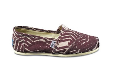
I bought my TOMS last night! I blogged about TOMS shoes awhile ago, this pattern was one of my original picks, but I went with purple rather than blue. I should have them in a few days!
Saturday, May 8, 2010
Design Archives Part 1
One of my main goals when first creating this blog was to use it as a way to keep current with (and creating) good graphic design. So far, I haven't really featured much of it, so I've decided that once a week I will do an entry called Design Archives. Each of these entries will include pictures I pull from my folder of "inspiration", which simply is a folder on my laptop full of pictures of what I think is good graphic design. I will also include some sort of commentary on why/what makes is good graphic design.
I haven't been very good at sourcing where my images come from (most of these, in fact I think all of them, come from The DieLine) I need to get better at this, it's VERY important to give credit where credit is due.
I haven't been very good at sourcing where my images come from (most of these, in fact I think all of them, come from The DieLine) I need to get better at this, it's VERY important to give credit where credit is due.
- Paulette: If I knew where I could buy these delish looking cookies, I'd be all over it. It's so obvious, it's almost clever, that the double T's should become a cookie...that idea is carried through each letter as the stroke all have the characteristics of the cookie. The varying opacity of the background illustrations add subtle interest to what could have easily become over done or...boring
- Crab Meat Packaging: The tag line "Seafood & Eat It" is a GREAT play on the well "see-food diet" It made me smile and laugh and that's good enough for me!
- Crazy Foam: What little kid wouldn't want to take a bath if they got to use Crazy Foam? Each bottle becomes a character and could easily keep a child entertained in the tub. Form and function, I give it an A+!
- Treo: I'm not even sure anymore what this is, but I love, love, love the typography and color scheme. Lately I've really been digging slab serif typefaces, so it didn't surprise me when I pulled this image for my first Design Archive post.
- Chocolate Bar Packaging: I love that this packaging takes a totally different approach than the normal "sensual, expensive, silky" images of chocolate packaging and advertising. I admire how detailed the illustrations of the Cacao Plant, from which chocolate comes from. And again I love the typography. It's simple and the percentage of cacao was a lovely idea.
Subscribe to:
Comments (Atom)


